AP+I Design
AP+I Design is a women- and minority-owned interior architecture and environmental graphics firm based in Mountain View, CA, specializing in workplace environments for tech companies.
When I joined as Marketing Designer, the firm lacked a cohesive brand system. Social media was inconsistent, proposals varied widely in structure, and there were no documented guidelines or templates.
Over four years, I led the implementation of a new brand system across proposals, presentations, marketing, and social media which gave AP+I Design a structured look and feel across all communications.
April 2022 - Present
Marketing
Graphic design
Brand identity
Social media management
Web design
Photography
Videography
Credits
Photography, John Sutton
Marketing, Shelby Larios

The Challenge
After 30 years in business, AP+I Design underwent a rebrand to modernize its identity and better reflect its market positioning.
After the rebrand, there were no structured systems or tools to support daily execution. Social media was inconsistent, proposals relied on outdated templates, and brand usage varied widely across materials.
The challenge: translate a new brand identity into a scalable system that interior designers and marketers could use efficiently under tight deadlines.
The Approach
Key priorities:
-
Define typography hierarchy and layout structure/grids
-
Establish color and logo usage standards
-
Create modular proposal and presentation templates
-
Build repeatable social media templates
-
Ensure consistency across print and digital touchpoints
-
The goal was clarity, efficiency, and a cohesive brand presence.
Brand Identity/Guidelines
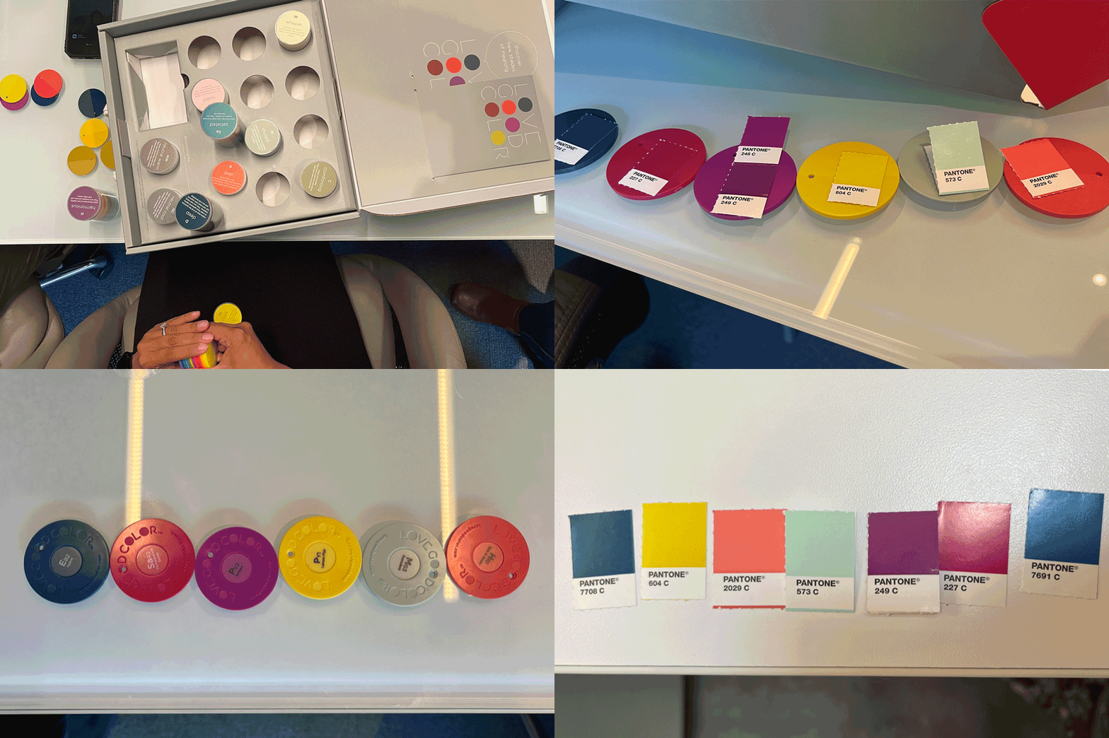
My contributions in the rebrand of AP+I were focused on color and iconography. In the color workshop I led, we chose colors that spoke to the diversity and background of the firm.
In hindsight, I would've done this process differently and focused more on my knowledge of color theory and psychology rather than the personal connections the principals had to each color.
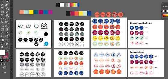
With the determined color palette, I created icons for a variety of different applications.
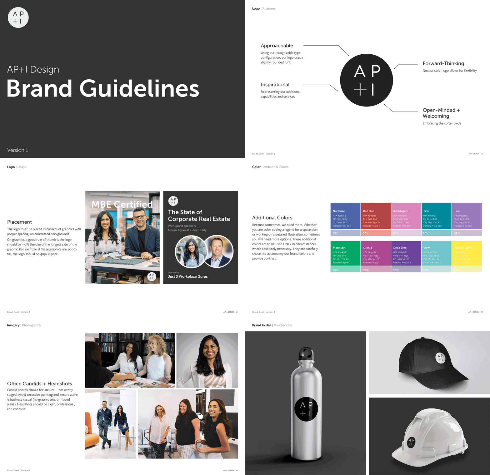
After working on the rebrand, I translated it into a functional system by developing brand guidelines and leading firm-wide training.
My contributions included:
-
Typography hierarchy and grid logic
-
Color usage standards
-
Logo and spacing rules
-
Layout principles
I led a 30+ person training to ensure the system was usable and consistently applied across the organization.
Selected pages shown. Full guidelines available upon request.


Process


Color workshop
Icon testing
Presentation/Proposal Design
Proposals are central to AP+I’s business development.
Because interior architecture is highly visual, presentation design needed to support imagery while clearly communicating complex processes.
I developed a modular slide system that:
-
Prioritizes large-format imagery
-
Maintains strong visual hierarchy
-
Minimizes on-slide text
-
Supports verbal storytelling
A fully custom proposal can take ~30 hours. With structured templates and boilerplate modules, standard proposals can now be produced in under 10.
Over four years, I created hundreds of branded presentations now used daily by the team.
Most proposals are protected under NDAs. Please contact me for samples.
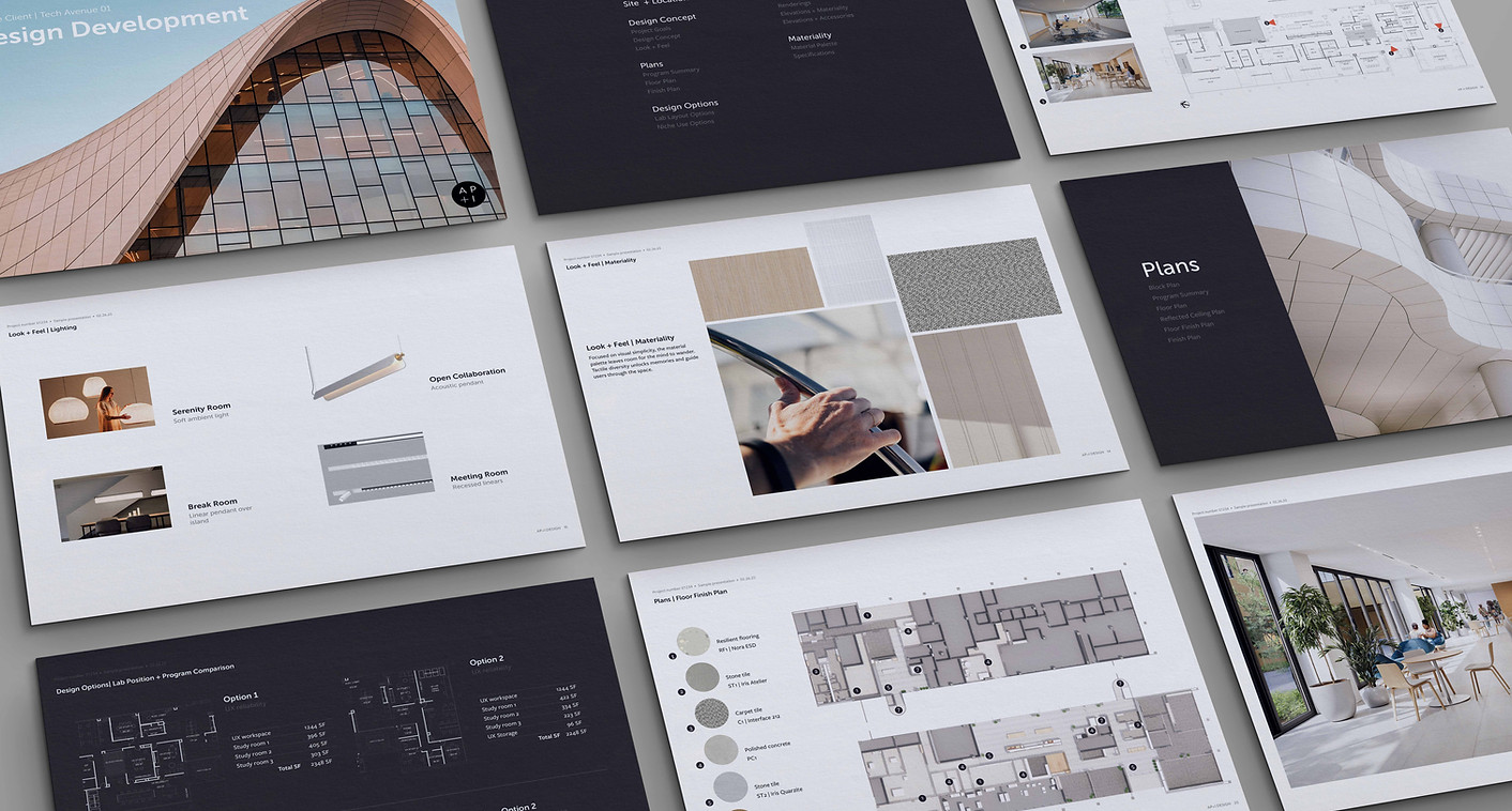
Design presentation template
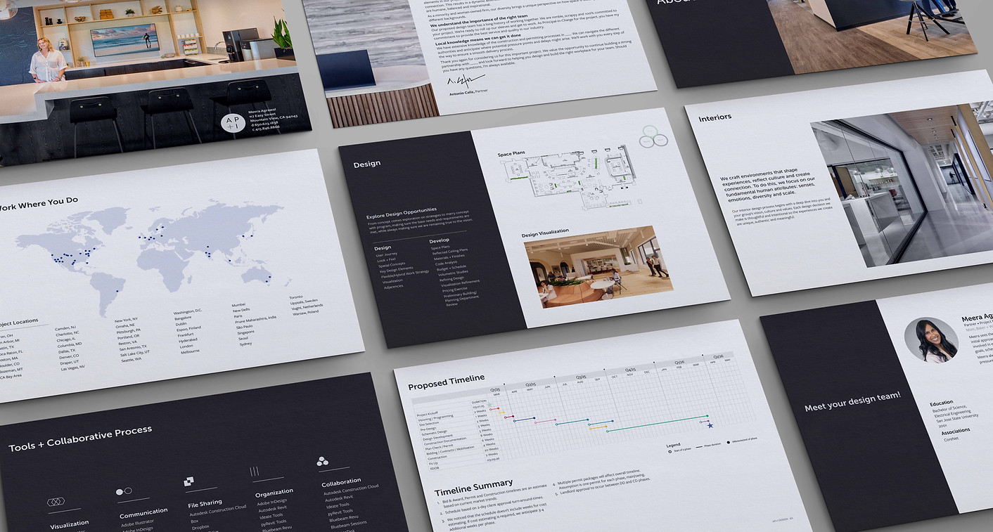
Boilerplate proposal template
Marketing Collateral
I extended the brand into print and promotional materials, including:
-
Business cards
-
Postcards
-
Brochures
-
Marketing materials
Managed projects from concept through print production, ensuring alignment with the broader visual system.


Project posters hung up inside the office
Social Media
Repositioned social media to showcase not just projects, but the people behind them.
Built a flexible content system that:
-
Highlights team personality
-
Reinforces diversity and culture
-
Maintains visual consistency through templates
This approach improved engagement, strengthened industry visibility, and supported hiring efforts.

Website
Supported the relaunch of the website to align with the new brand system.
Contributions included:
-
Visual consistency
-
Content structure support
-
SEO optimization
-
Analytics tracking
The updated site reflects a more polished, cohesive identity.